
In this article
You can have the best ranking in the world on Google. If your website doesn't give people a reason to do anything, you've just paid for traffic you can't use.
What CRO really is — and what it isn't
CRO stands for Conversion Rate Optimisation. In plain English: making it easy for people to do what they came for.
A conversion isn't necessarily a purchase. It could be booking a meeting, signing up for a newsletter, downloading a checklist, or filling out a contact form. It's what you, as a business, define as 'a customer taking a step'.
The problem is that the field of CRO has been hijacked by tool vendors selling A/B testing subscriptions for 5,000 a month, and by agencies testing button colours on pages with 200 visits a week.
That isn't CRO. It's theatre.
Real CRO is one question, repeated throughout the entire customer journey: what's stopping this person from doing what they came for? The answer is almost always UX. Not the colour of a button.
Why SEO without CRO is a waste
Let's do some maths. Imagine you get 1,000 visits a month from Google. Your conversion rate is 0.5% — five out of a thousand get in touch.
What's the value of an SEO investment that doubles your traffic to 2,000 visits? Ten customers instead of five. Nice.
What's the value of a CRO investment that lifts the conversion rate from 0.5% to 2%? Twenty customers. Same traffic. Four times as many customers.
This doesn't mean SEO is wrong. SEO is the foundation — you can't convert people who never arrive. But SEO without CRO is like opening a restaurant in the city centre and forgetting to put up a menu. People come in, look around, and leave again.
It's not a traffic problem. It's a website problem.
The UX factors that actually move the needle on conversion
No list can cover everything. But after reviewing many customer journeys, I see the same things time and again. This is what actually makes the biggest difference, in prioritised order:
The seven UX items I check first
- A clear value proposition above the fold — one sentence that says who you help with what, not 'we've been delivering quality since 1998'.
- Specific CTAs that describe the action — 'Book a 20-minute meeting' beats 'Learn more' every time.
- Mobile first — the page loads in under three seconds, and all buttons are clickable with a thumb.
- Social proof near the decision point — quotes and reviews next to the purchase button, not hidden in the footer.
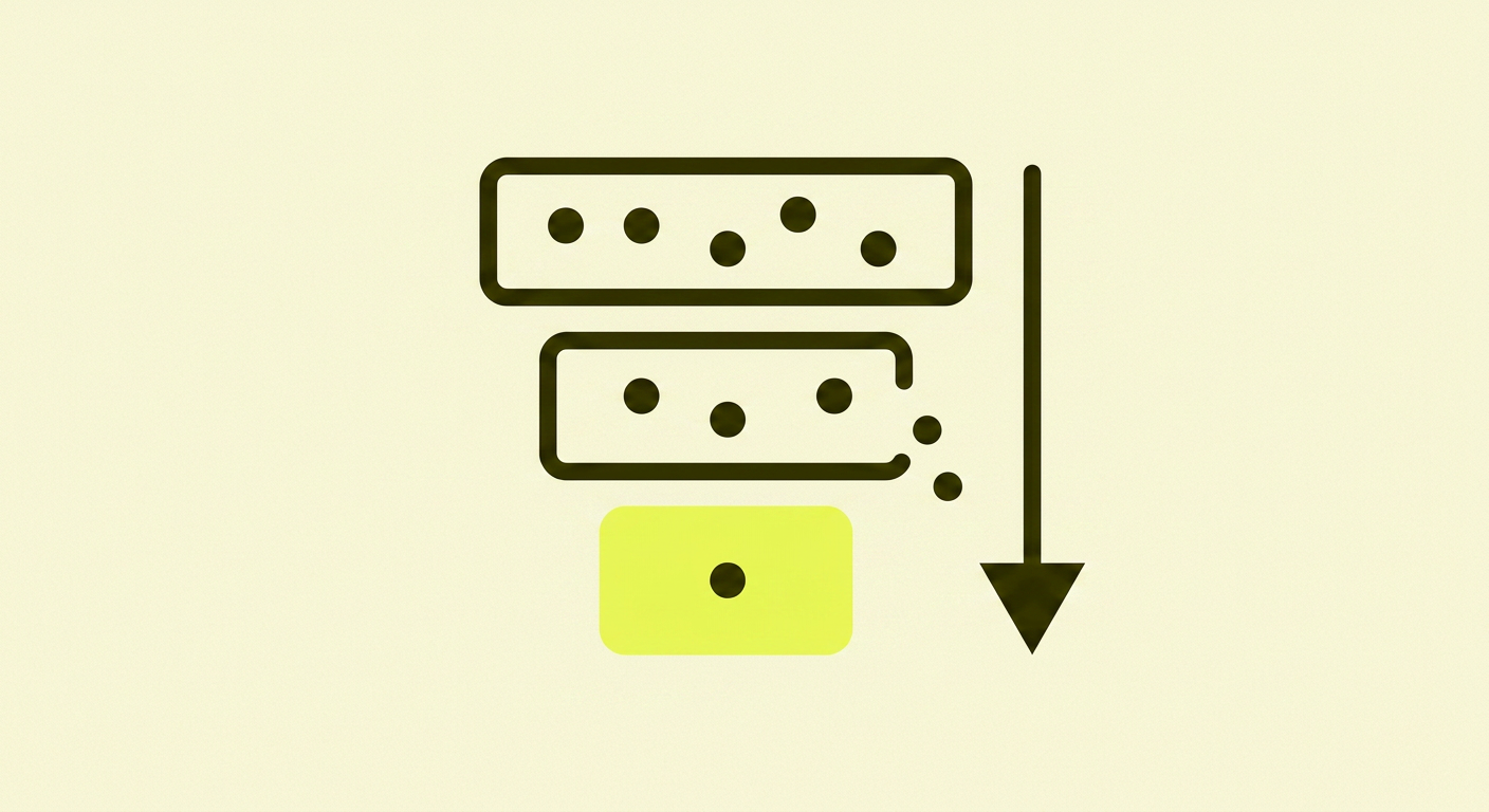
- Frictionless forms — only the fields you actually need, no mandatory phone number.
- Readable content — good contrast, short paragraphs, line length under 75 characters.
- Accessibility — alt text on images, semantic HTML, works with a keyboard and screen reader.
It's no coincidence that forms are high on that list. The Baymard Institute has studied form and checkout design for many years, and the result is always the same: every extra field costs you conversions.
When you should actually test — and when you should just fix
A/B testing is useful. But it's not useful until you have enough traffic to get statistically significant results. As the Nielsen Norman Group summarises, the average conversion rate for websites is around 2–3%.
This means that if you have 1,000 visits a month, you might have 20–30 conversions. To see a reliable difference between two variants, you need at least 1,000 conversions per variant. With your current traffic: about five years per test.
The rule of thumb I use:
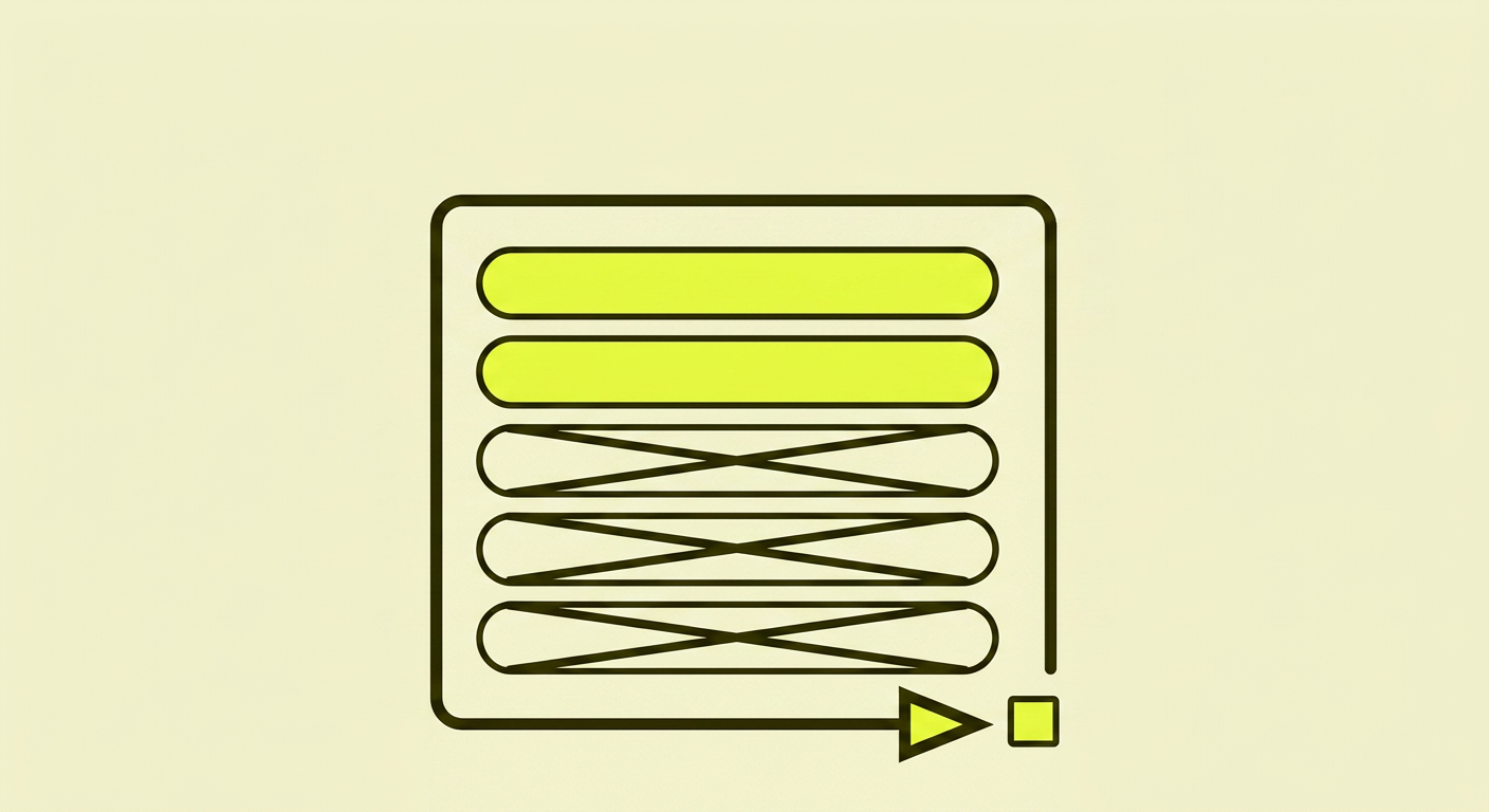
- Fewer than 5,000 visits a month: no A/B testing. Just fix the obvious. Remove unnecessary form fields. Rewrite the CTA. Test your mobile site yourself and fix what's annoying.
- 5,000–50,000 visits a month: test big changes one at a time — a new sales page, a new pricing model, a new form. Not button colours.
- Over 50,000 visits a month: structured hypothesis testing, but still: hypotheses based on data, not guesswork.
The important thing isn't whether you test. The important thing is whether you remove friction.
Mobile and speed — the invisible conversion killer
More than 60% of web traffic in the UK is mobile. If your page takes four seconds to load on an average 4G connection, a large portion of visitors will have already gone back to Google before it's finished loading.
Google's Core Web Vitals measure exactly this — how quickly the page becomes usable, how stable it is, how responsive it feels. It's not about a perfect score in a tool. It's about the fact that every half-second counts when someone is waiting on their phone.
Check your site in PageSpeed Insights — not on your ancient MacBook with fibre, but on a mobile with a poor signal. That experience is what 60% of your customers get.
Accessibility is conversion — even for those without disabilities
Many people think of accessibility (WCAG, the W3C's guidelines) as 'that thing we have to do for visually impaired people'. That's the wrong way to think about it.
Accessible design is better design for everyone. Good contrast helps you read in bright sunlight. Clear buttons help you if you have fat fingers on a small screen. Alt text helps Google understand your images. Semantic HTML helps screen readers — and search engines.
Every accessibility improvement is also a conversion improvement. It's one of the few areas where the right choice is also the profitable choice.
What I see time and again with clients
After analysing many small and medium-sized UK websites, I see the same things over and over. If you recognise yourself here, you know where to start:
- The homepage says what the company does, not who it helps and with what
- The main navigation has seven menu items where it should have three
- The primary CTA is 'Contact Us' — so generic that no one clicks
- The form has eight fields where it should have three
- There's no social proof (reviews, case studies, client names) on decision-making pages
- The phone number is in the footer — not in the header where it would be helpful
None of these require a CRO tool. They just require you to take the time to see the site through your customer's eyes, and to be willing to be honest about what you find.
In summary: CRO isn't magic, it's thoughtfulness
CRO isn't a discipline you have to buy into. It's an attitude towards how your website works for the people who use it.
It means being critical on your own behalf. Reading your pages as if you were a stressed mum with three minutes to spare, or a pensioner on an old iPad. It means removing things more often than adding them.
And it means understanding that traffic without conversion is the most expensive thing you can have — you've paid for every single visit, through time spent on SEO, content, or ads. If the site is leaking, it's leaking money.
CRO isn't a one-off project. It's a way of looking at your website every time you add a new page, a new form, or a new button.
Further reading (for the particularly interested)
Want to dive deeper into UX and conversion optimisation? Here are the resources I return to myself:
- Nielsen Norman Group — Conversion Rates — solid foundational research on what actually moves the conversion rate
- Baymard Institute — Checkout & Form Design — the industry's most thorough research on form and checkout design
- web.dev — Core Web Vitals — Google's own explanation of what's measured and why it matters
- W3C — WCAG Guidelines — the official standard for web accessibility