In this article
A CTA is what people mean when they say "the thing that actually gets someone to do something". But most CTAs I see on Norwegian websites are written without thought, placed on autopilot, and designed as an afterthought. It's one of the biggest missed opportunities where SEO and business results overlap.
What is a CTA?
A CTA (call to action) is an encouragement for the reader to do something specific. It can be:
- A button: "Book demo", "Add to basket"
- A link: "Read how we did it"
- A form: "Get a free price estimate"
- An instruction: "Call 40 12 34 56 for quick help"
Without a CTA, the reader doesn't know the next step. With the wrong CTA, they might click, but the conversion doesn't happen. With the right CTA in the right place in the right context, you capture the business value that SEO traffic is supposed to deliver.
How CTAs and SEO are connected
Google doesn't measure CTAs directly, but CTAs affect signals Google does care about:
Dwell time and time on page. A reader who clicks through to a relevant, converting page spends more time on the site in total. That's a positive signal.
Click-through rate (CTR) from search results. If your page has a clear value and a clear next step, it increases the likelihood that the user will stay, instead of jumping back to Google (pogo-sticking).
Pages per visit. Well-designed internal CTAs send the reader from article to article or from article to product page, which increases engagement.
Conversion. Although Google doesn't see the conversion directly, user signals over time reflect whether the page actually helps people. A page that gets people to buy, call, or sign up accumulates signals that support long-term rankings.
Anatomy of a good CTA
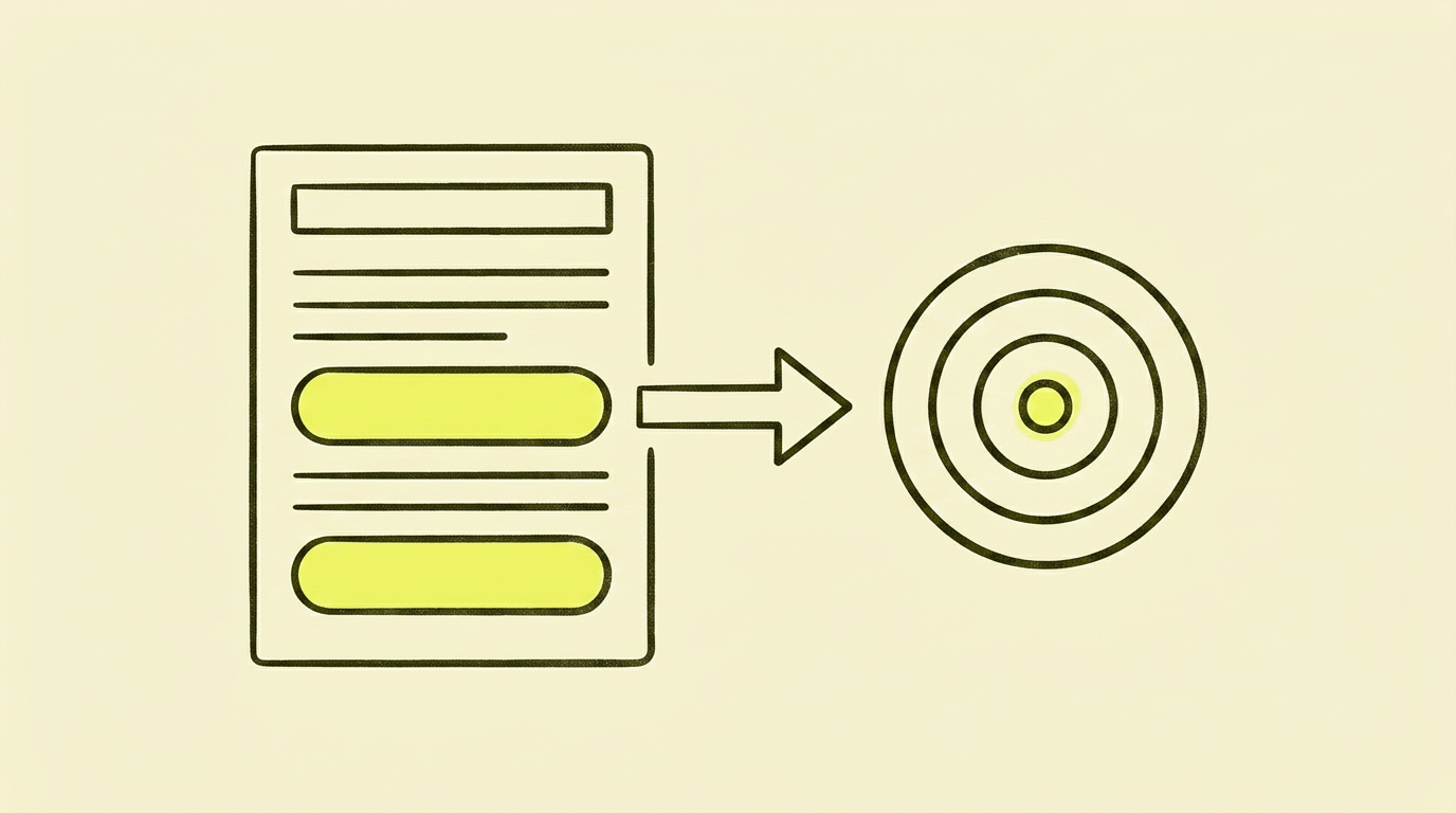
Verb first. Start with an action verb: "Book", "Download", "See", "Compare", "Try". Not "Click here", not "Info".
Value-oriented, not function-oriented. "Get your SEO test" beats "Submit form". "See your company's visibility" beats "Run analysis".
Specific, not abstract. "Download 5-page checklist" beats "Download resource". "Book a 30-minute strategy call" beats "Contact us".
Low-friction language. "See the price for your business" (no obligation, clear) beats "Buy now" (high commitment). Reserve "Buy now" for the point when the user is actually ready.
First-person sometimes. "Yes, I want the guide" can convert better than "Download the guide" according to documented tests, because it signals ownership. Don't overuse it—it can seem manipulative if everything is in the first person.
Placement: where and how many
The number and placement depend on the page type.
Informational articles (like this one)
- No CTA before the reader gets value. No blocking pop-up, no banner above the fold.
- 2 to 4 CTAs spread throughout. One early on for those quick to convert, one or two in the middle once value has been delivered, and one strong one towards the end when the reader has the full picture.
- Match intent. If the article is about an SEO audit, the CTA is "book an audit" or "download the checklist". Not "buy a subscription" or "see product catalogue".
Product pages
- Primary CTA above the fold. Clear, dominant, in a colour not used elsewhere.
- Secondary CTAs further down. "Download datasheet", "Compare with other products", "See reviews".
- Sticky CTA on mobile. Consider a fixed "Add to basket" button at the bottom of the screen.
Service pages
- Primary CTA above the fold: "Book a meeting", "Get a price estimate".
- Social proof CTA in the middle: "See what customers are saying".
- Expanded primary CTA at the bottom with a form, not just a button.
The homepage
- One clear primary CTA in the hero section. Decide what you want 80% of visitors to do first.
- Secondary CTAs in sections: for specific target audiences or needs.
Design principles that work
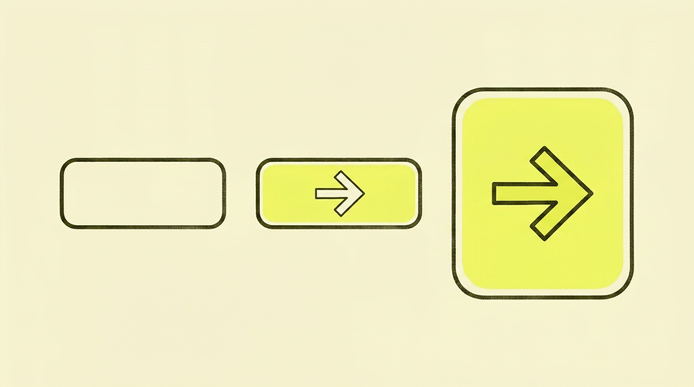
- Visual hierarchy. The primary CTA should be clearly different (colour, size, placement) from secondary ones.
- Enough whitespace around it. A CTA squeezed between two blocks of text will disappear.
- Contrast. The button must stand out from the background. Test it on mobile; that's where most people will see it.
- Don't overload. Five primary CTAs in one section compete with each other. One primary, the rest secondary.
- Clickable area. Buttons must be at least 44x44 pixels for thumb presses. Check on mobile.
Copy: what you actually write
The text itself is where you'll get the biggest lift. Colour, size, and position are marginal compared to what the words say. Here's a simple recipe:
Formula 1 — Action + Value:
"Download the SEO checklist" (action + implicit value) "See what's holding you back in Google" (action + specific value)
Formula 2 — Action + No-commitment timeframe:
"Book a free 30-minute review" "Get a price estimate in under 24 hours"
Formula 3 — First-person agreement:
"Yes, I want the SEO test" "Show me the plan for my business"
Formula 4 — Challenge/Solution:
"Fix these 5 things before the next Google update" "Stop losing traffic in August"
Shorter is almost always better than longer. A maximum of 5 to 6 words is a good rule of thumb for buttons.
Common mistakes I often see
- "Read more" buttons everywhere. They say nothing about what's behind the click and convert poorly.
- CTA before the reader gets value. A pop-up that appears 3 seconds after loading. Penalised by both Google and readers.
- Five competing CTAs in the same section. No priority, so the reader chooses none.
- CTA that doesn't match intent. "Buy now" on a "what is X" article. Wrong stage, wrong response.
- Hidden CTAs. Grey text on a grey background, the same colour as the body text, placed under a heavy image-loading area.
- No mobile optimisation. The CTA works on desktop but becomes tiny and unclickable on mobile.
- Forms with 12 fields. Each extra field reduces conversions. Do you really need the company's revenue bracket to answer an enquiry?
Case study: From 0.3% to 2.1% conversion on an informational page
An article on a technical topic received high traffic (12,000 visits/month) but only converted 0.3% to a review booking. The content was solid, and the technical SEO was in order.
Diagnosis: A single CTA at the bottom of the page with the text "Contact us". No indication of what happens next, no value communicated, placed as an afterthought.
The action: We added three CTAs spread throughout:
- After the intro (25% down the page): "Download a template for what I'm describing" (low friction, requires one email).
- In the middle (55%): "Book a 20-minute review on Zoom" (value clearly stated).
- At the bottom: a dedicated CTA block with three bullet points about what you get, and a 3-field form (instead of just "Contact us" text).
The result: The total conversion rate from the page went from 0.3% to 2.1% over 90 days. Pages per visit increased from 1.4 to 2.3. The average time on page increased from 1:47 to 3:22. No changes were made to the article content itself.
Your action plan: Step-by-step
| Step | What to do |
|---|---|
| 1 | List the 5 pages with the most traffic on your website. |
| 2 | For each one: identify the primary CTA. Is it clear, value-oriented, and matched with intent? |
| 3 | Replace "Click here", "Read more", and "Submit" with specific, value-oriented text. |
| 4 | On informational pages: add 2-3 CTAs spread throughout, not just one at the bottom. |
| 5 | On product/service pages: ensure there is one clear primary CTA above the fold, with secondary ones lower down. |
| 6 | Check on mobile. Are the buttons 44x44 px or larger? Are they clickable without zooming? |
| 7 | Remove or minimise pop-ups that block content immediately. |
| 8 | Reduce the number of fields in your forms. Remove anything that isn't strictly necessary. |
| 9 | A/B test text before colour. One change at a time, with a minimum of 2 weeks per test. |
| 10 | Track user signals in GA4: time on page, pages per visit, conversion rate per page. |
In summary: My take on CTAs and SEO
CTAs are where SEO efforts either deliver business value or don't. You can have technically perfect SEO, great content, and high rankings, and still get zero sales—if your CTAs mean readers never take the next step.
Set aside an hour. Open your five most important pages. Read each CTA out loud. Would you click it? Do you know what happens next? Is the value clear?
If the answer is "no", you have your first improvement. It's no more complicated than that—but it's often what separates solid traffic from real growth.
For interesting further reading, my article on CRO is really about UX goes deeper into conversion, user experience, and how the two disciplines are connected.