Background: a website that held the client hostage
Torp&Co in Majorstuen runs a multidisciplinary treatment and training studio. Physiotherapy, osteopathy, chiropractic, massage, personal trainers, all under one roof.
The problem wasn't the practice. It was the website.
They were running an outdated WordPress install with 27 active plugins. Each had to be updated, many cost money, and every one was a potential security hole. They were locked to their agency for every change, including the trivial ones.
The turquoise was a legacy from an older brand strategy. The gold was meant to be rolled out everywhere, but doing that through the agency turned out to be so heavy and expensive that it never got finished. Instead Torp&Co would collect change requests and order them in batches, to avoid single hours and small invoices, and every edit had to be weighed against the cost.
That's not a technical description. It's a business problem. A website that costs money every time it wants to say something new ends up saying very little that's new.
The core wish from Torp&Co was as clear as it was unusual: they didn't want to depend on the agency, or on me, going forward. It was going to be their own website.
The entire relaunch went from first discovery to launch in two months.
What I did
1. New design aligned with their actual brand
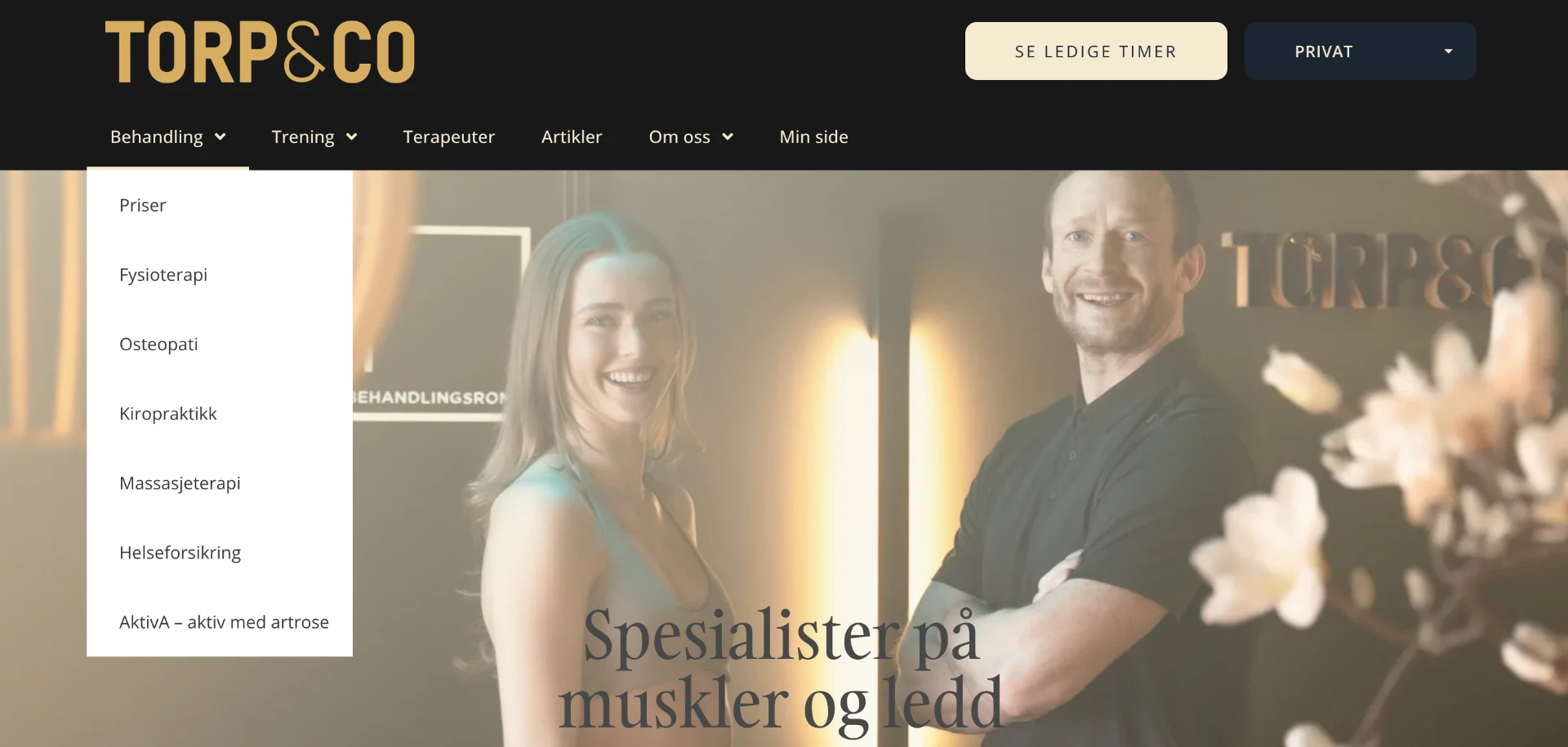
The old site had a black/gold logo up top, an aggressive turquoise seeping through every CTA and accent element, and a completely different tone in the imagery. The client didn't recognise themselves.
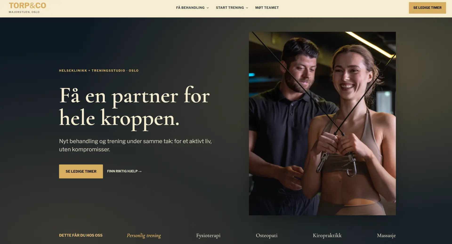
The new design starts from Torp&Co's actual brand: cream as the base, deep navy as the anchor, gold serif typography that echoes the logo. The turquoise is gone, and the gold that was meant for the whole house is now actually there. The emphasis is on photography, air and clear hierarchy.
The site is built with Lovable, the same tool I used for SmåSeo. I've written a separate piece on why I think AI-driven site builders are quietly changing the game: AI website builders: Lovable, Bolt and v0.
2. From a treatment list to a user journey
The old menu listed jargon: Physiotherapy, Osteopathy, Chiropractic, Massage. Fine if you already know what you need. Useless if you just have a sore shoulder and don't know the difference between an osteopath and a chiropractor.
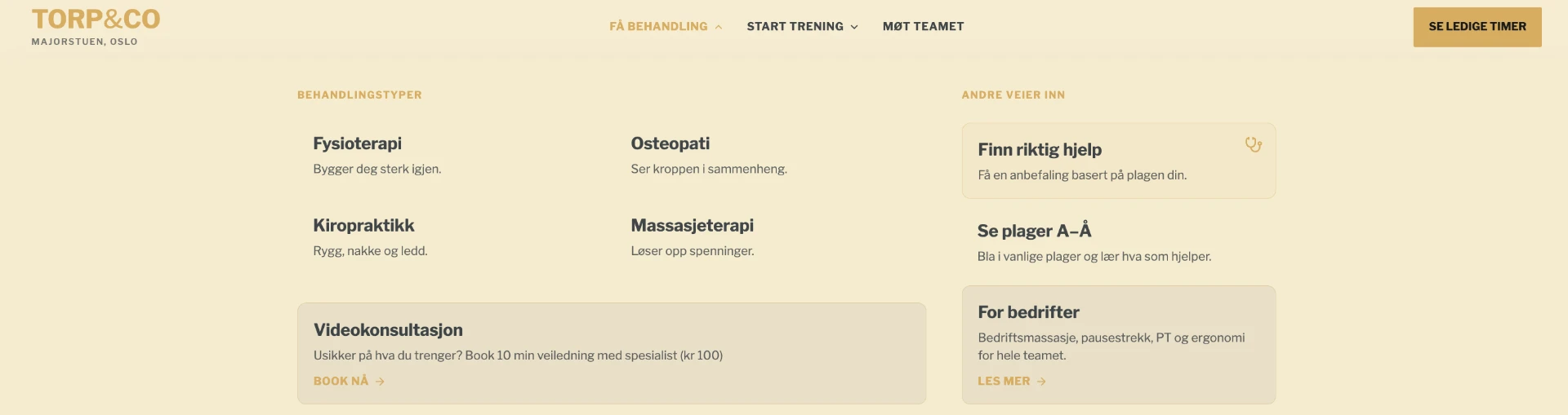
The new NAV flips that. Three entry points — «Get treatment», «Start training», «Meet the team» — with mega-menus that explain what you get, not just what it's called. Under «Get treatment» you'll also find «Find the right help», «Symptoms A–Z» and «For businesses» as alternative ways in.
3. A diagnosis funnel replacing the static sales box
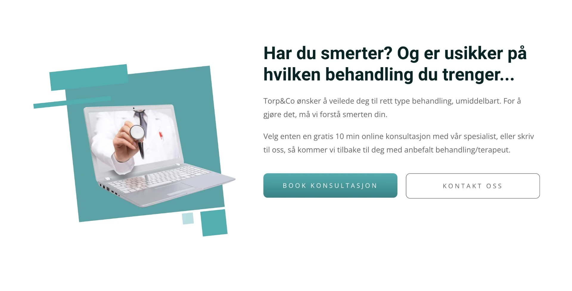
The old site had a nice but static section: «Are you in pain? And unsure what treatment you need…» — with two buttons: Book a consultation or Contact us. It dumped the entire job on the visitor.
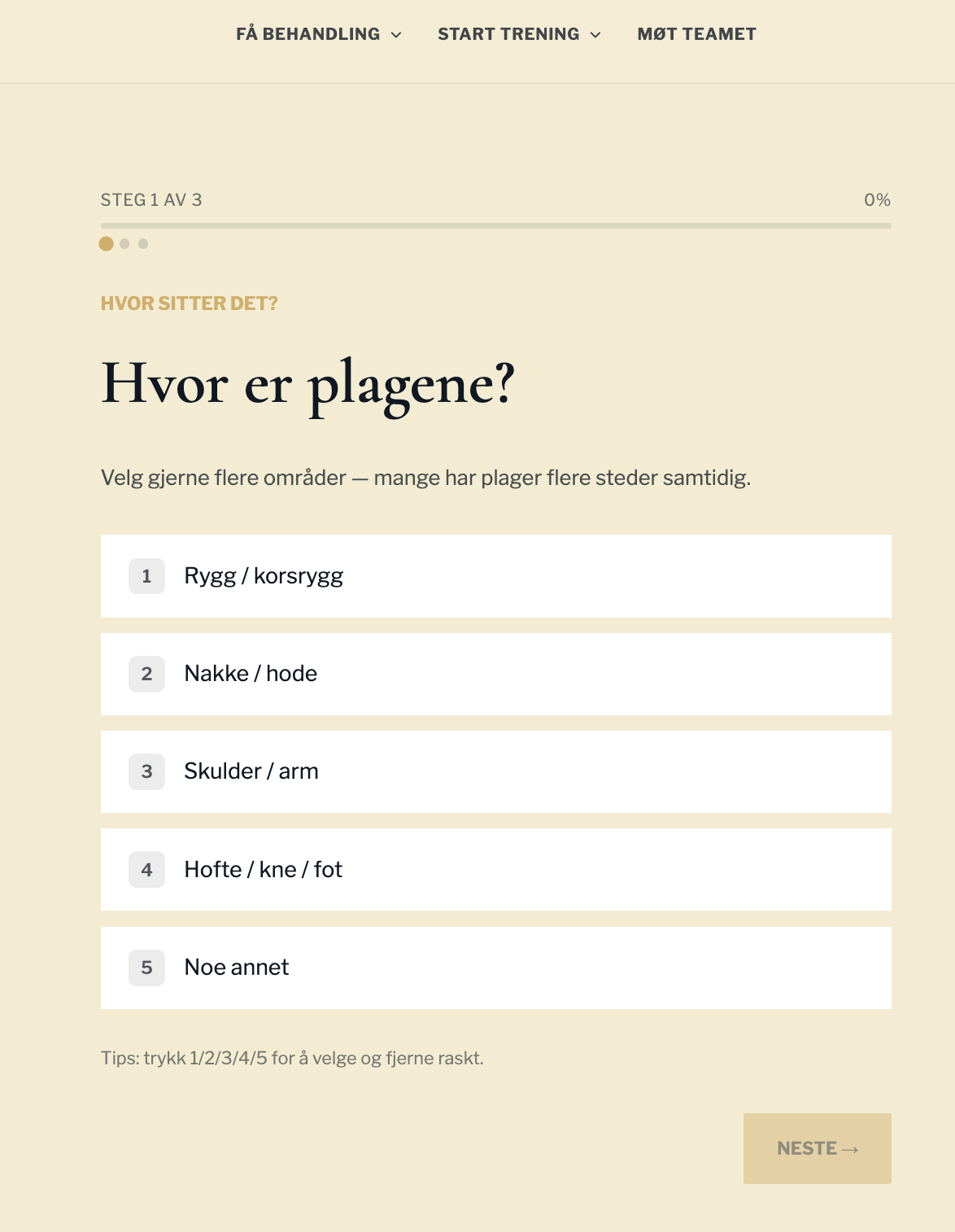
The new diagnosis funnel walks the visitor through three short steps — where it hurts, how long it's been going on, what makes it worse — and lands on a concrete recommendation and a booking offer. Same UX pattern as the SmåSeo diagnosis tool, adapted to Torp&Co's field.
4. Content, not just articles
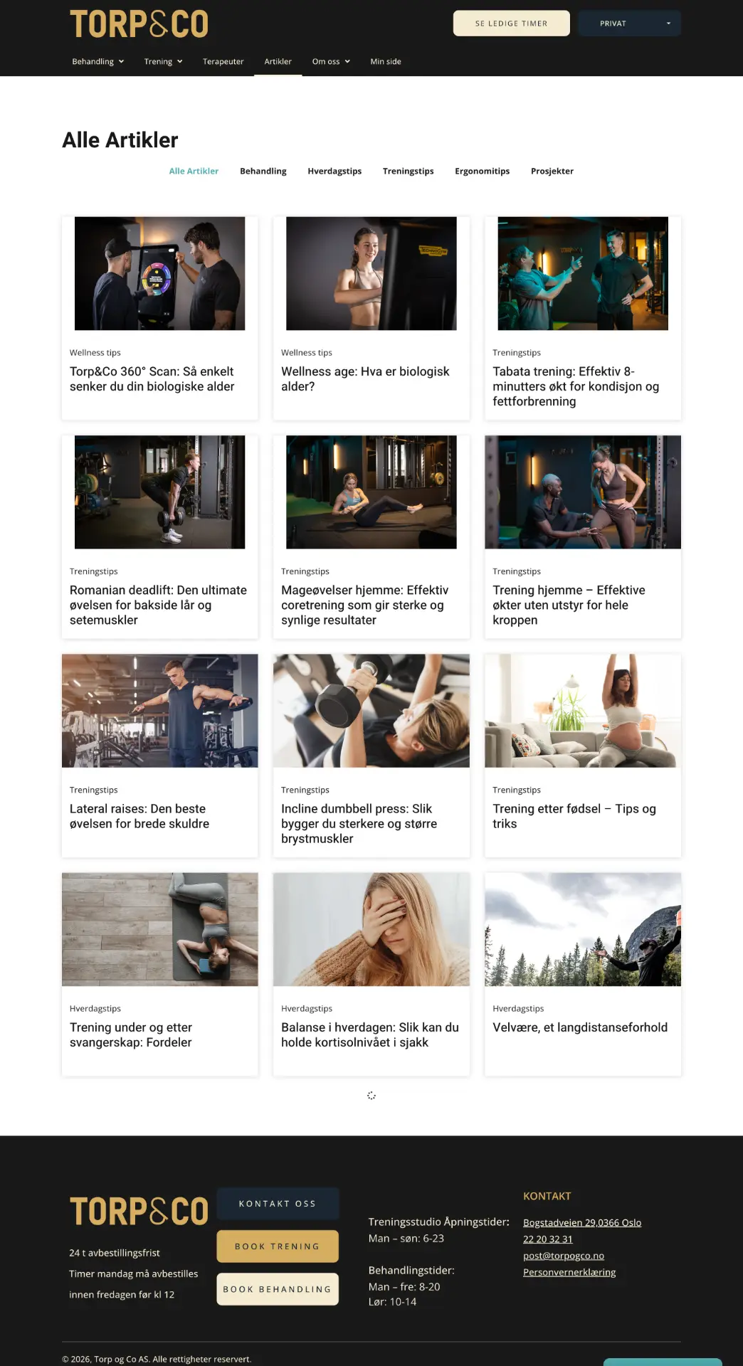
The old magazine was a steady stream of long training tips with stock photos. Fine, but nothing you'd recognise.
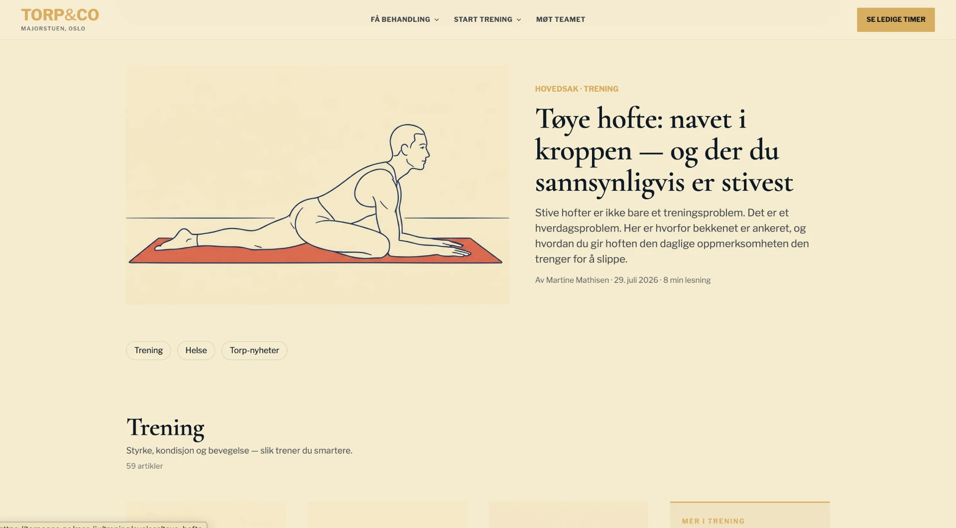
The new magazine is structured like a magazine. Lead story up top with a custom illustration in Torp&Co's palette. Category filters (Training, Health, Torp news). Every article has a named author, publish date, «last updated» stamp, reading time and a clickable table of contents, exactly the structure I recommend in How to write a good SEO text. Everything SEO-optimised with semantic structure and structured data, and at the same time written so AI-driven search surfaces pick it up, what I call GEO.
5. A team page that's actually useful
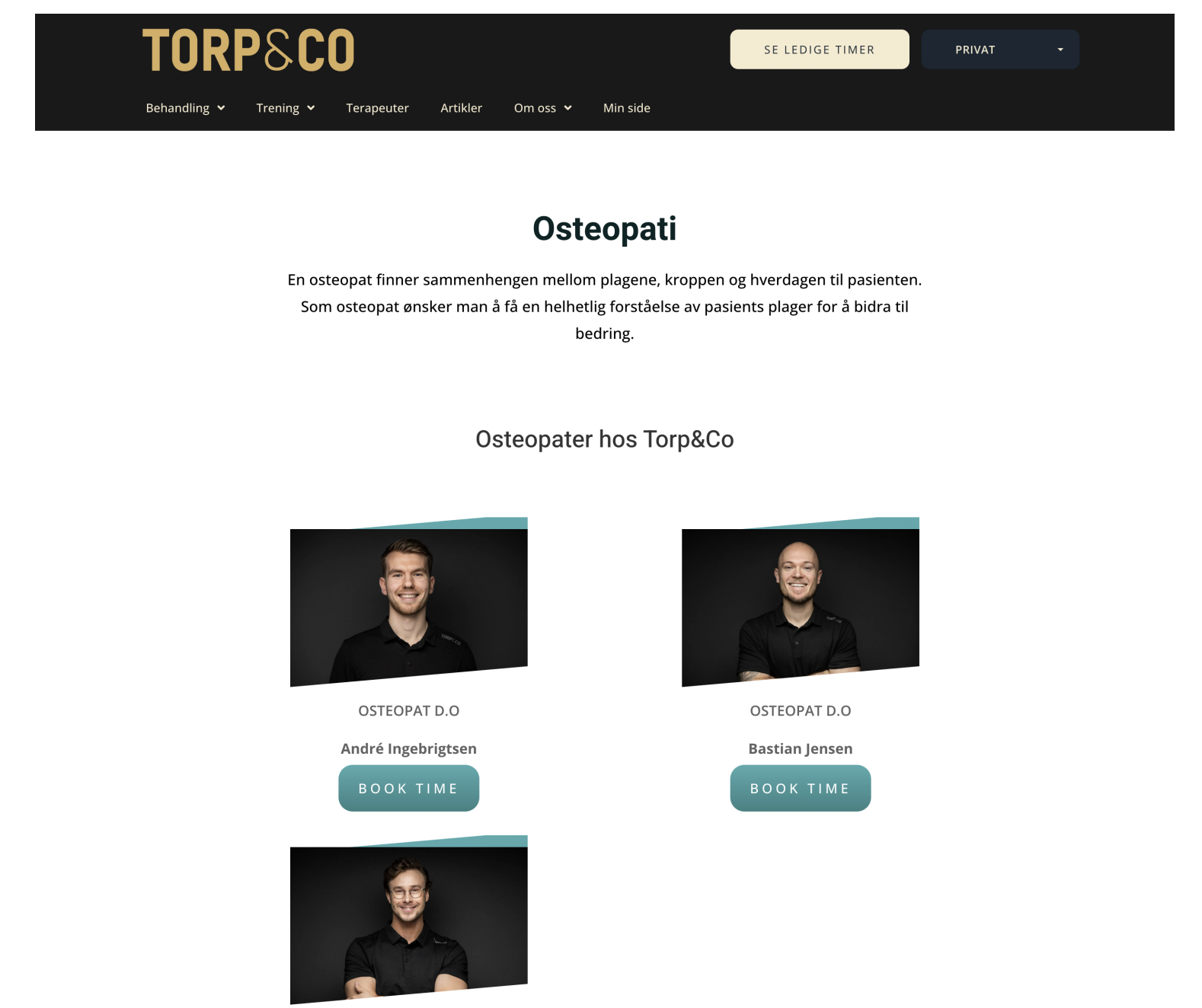
The old team page was one grid per treatment type. Two osteopaths listed, with slanted edges and turquoise decor blocks.
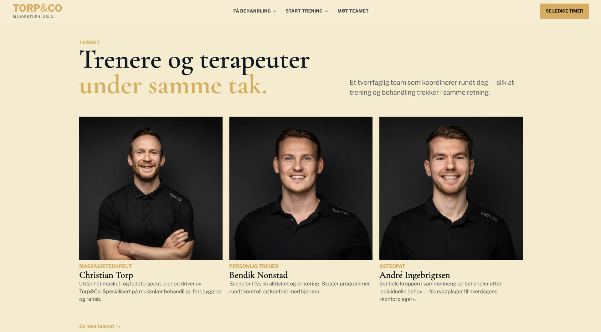
The new team page is filterable by role, symptom and training discipline. Portraits are larger, the copy is personal, and every therapist has their own sub-page that works as both a booking and an SEO landing page.
6. Products and pricing: transparent and editable
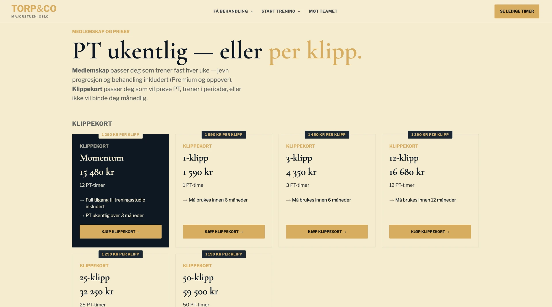
Punch cards, memberships, the Momentum package. All built as structured product components that Torp&Co can edit themselves — price, terms, availability — without calling anyone.
7. SEO, tracking setup and a migration without traffic loss
For me, the most important thing about a relaunch is that it doesn't become a traffic crash. That's why the URL structure was planned before the design, with a redirect plan that catches old addresses and forwards them to the new pages. I also set up GA4 tracking from the start, so we can actually measure whether the new site performs better than the old one.
The design choices were made with CRO and UX best practices in mind: clear CTAs, a menu that explains, and a diagnosis funnel that meets the user where they are. The goal isn't just to avoid traffic loss — it's for the site to deliver more value, and for Torp&Co to feel like this is a platform they celebrate, not another cumbersome «downer» they have to deal with.
What we cleared out
- 27 plugins — each with its own update cycle, security history and billable maintenance hours.
- The turquoise that clashed with the logo and never had roots in the brand.
- Agency dependency for global changes that should take minutes.
- Static sales boxes that dumped the whole job on the visitor.
- A jargon menu that assumed the visitor already knew what they needed.
The result: a website Torp&Co actually own
The site is live. The Torp&Co team can make global changes themselves, colours, copy, prices, new sections, without having to batch requests just to avoid small invoices. Visitors meet a menu that explains, a diagnosis funnel that guides, and a magazine that looks editorial.
And most importantly: the goal of Torp&Co not depending on their agency, or on me, going forward, has been met. I'm there if they want me, not because they have to.
Traffic numbers take time to mature after a relaunch, those will follow in a dedicated update. But the important part is already in place: the client has their website back.
My advice to you
If you're stuck on a site where you have to call the agency to change a colour, the problem is rarely the site alone. It's the combination of an outdated platform, plugin dependency and an agency that profits from you not being able to do anything yourself.
A relaunch isn't primarily about looks. It's about getting ownership back — of the design, the content, the user journey and the economics of all of it. If this sounds like you, see how I approach a new website with an SEO specialist.